Insights for leaders operating under pressure.
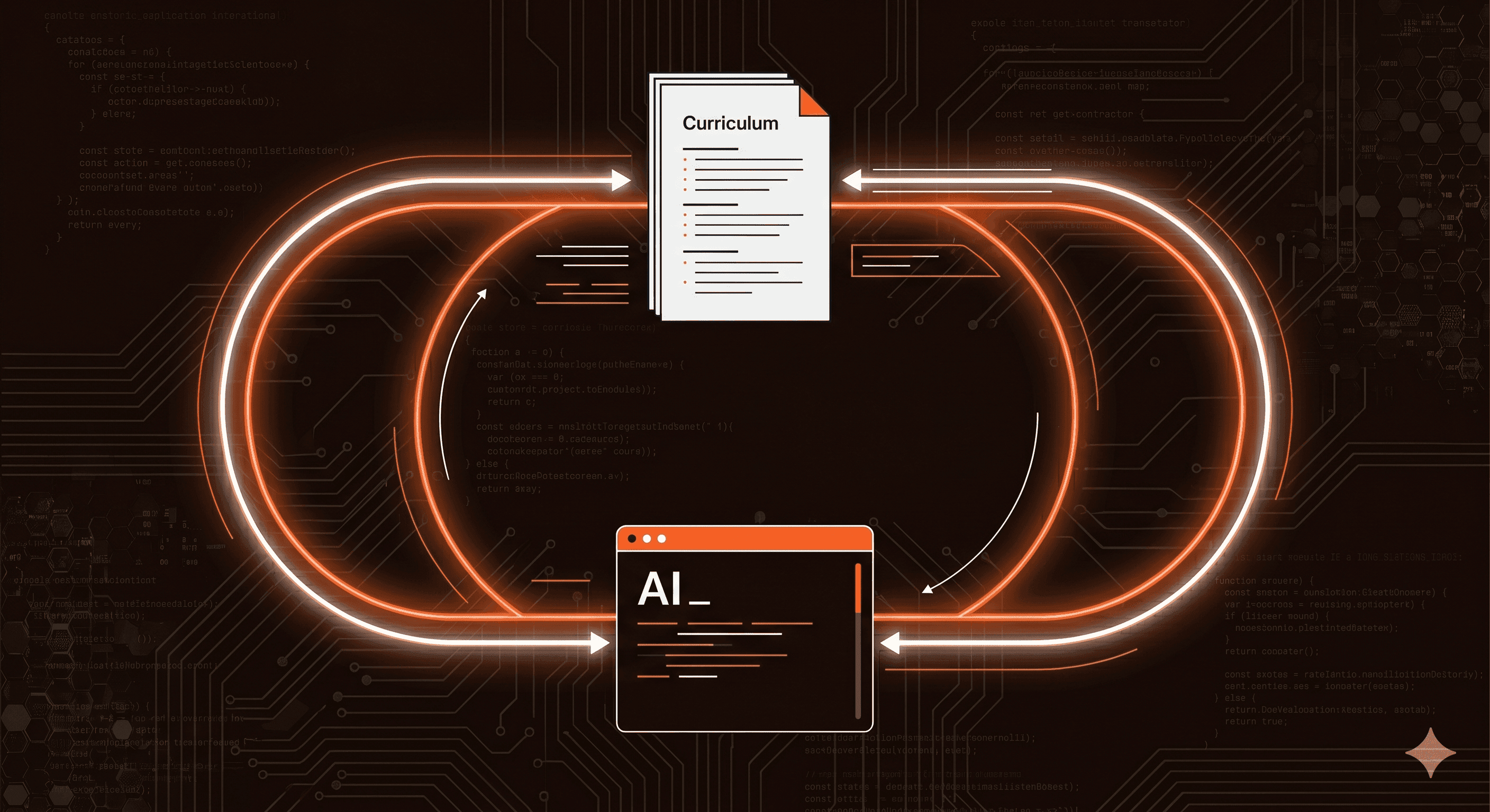
Operator-led thinking on systems, intelligence, and execution, designed to help leaders move with clarity when the stakes are real.
Operator-led thinking on systems, intelligence, and execution, designed to help leaders move with clarity when the stakes are real.
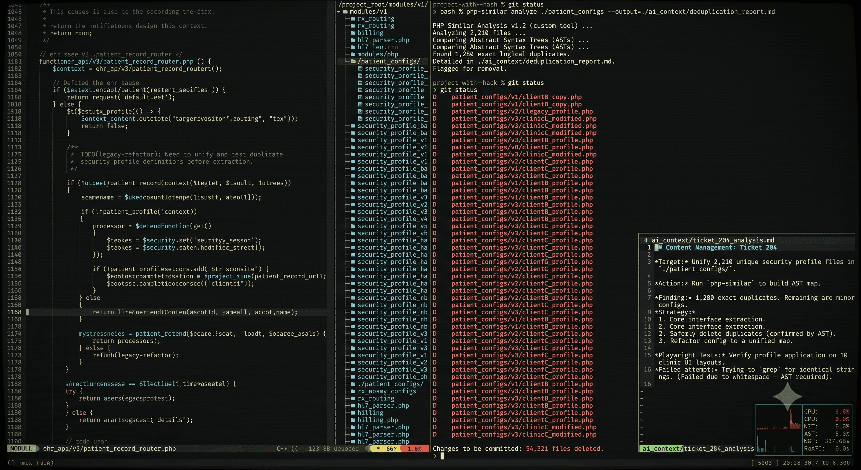
Rewired is our monthly field report for leaders accountable for whether AI compounds into growth or stalls before it gets there. This includes field notes from The Shop, in which we share patterns forming inside complex organizations before they become constraints.